Penguin and Random House Make Their Mark as Partners with New Logo
Publishing is based on the art of words and the emphasis was recently on the “art” as two powerhouse publishers merged and tried to paint their literary logos into a single picture of partnership. The publishing world watched and waited to see how these long-running logos would be banded and blended together. After months of online speculation, the answer was just revealed in a refined and discreet branding system that tastefully spells out the house’s new name in a way that can sit alongside all of their publishing imprints. The logo design is a gesture to the great range of works within their literary landscape and a symbol of their strong alliance as the world’s largest publisher of consumer books. Businessweek.com featured the story behind the new logo.
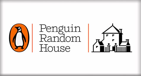
While the official logo was in development, the publisher had an interim logo that featured both publishers’ well-known symbols of the familiar penguin next to the signature stately house to signify the pair’s partnership.
The concept behind the new logo design was to capture the synergy among Penguin Random House’s 250 independent publishing houses and harness that into a visual vehicle that would reach a global audience.
Since the publishers were near-equals in the literary world, the challenge lay in expressing their multifaceted merger. The logo would have to convey the prominence of their partnership, while retaining the heritage of each house and the independence of their imprints.
After many failed attempts to combine their prior logos into a hybrid image, the designers were pleasantly surprised that a simple wordmark with rotating imprint logos was the branding system preferred by the publishers.
The wordmark is in a delicate font that silently supports its adjoining imprint logo to signal a proud association. Its elegant Shift typeface mimics the markings of a classic typewriter and deftly refers to the publisher’s business as a merchant of words. And the typeface’s serif style conveys an intimate warmth that defies the publisher’s corporate enormity.
Despite all of the work and wait, the new wordmark will rarely be used beyond basic corporate communication. But its value as the mark of a publishing partnership extends beyond words.
Discover how a strong logo design can capture your brand’s message and convey it to the world. Contact MDG.
MDG is a full-service advertising agency and one of Florida’s top branding firms. With offices in Boca Raton and New York City, MDG’s core capabilities include creative, branding, logo design, print advertising, digital marketing, mobile marketing, email marketing, media planning and buying, radio and TV advertising, outdoor advertising, newspaper, video advertising, Web design and development, content marketing, lead generation, mobile marketing, social media marketing, and SEO. To discover the latest trends in branding and advertising, contact MDG.